

This is a guest post from Helen Ascott, Fly Design.
Fly is a small but very creative, multi disciplined design agency with more than 30 years’ experience. They are truly passionate about design concepts and utilising their best creative abilities for client projects, from brand to business cards and everything in between.
Two faced? When I say face, I mean typeface. For type ‘faces’ are really just like real faces; they have personality and age; some are babies; some are old and stuffy; some are mean; some are friendly and some are hilarious. All manner of traits can be represented in a typeface, for they are as varied as faces are. There are alleged to be around 200,000 fonts out there.
Now that’s a lot to choose from. To the untrained eye it could be bewildering, but for those of us slightly smitten with type, it’s a pleasure, and there are never enough!
So why is this important? Well the right font can speak a thousand words and it can communicate your values and aspirations accurately. Type has subliminal qualities and can express many different emotions and moods. This is why companies spend what seems like a vast amount on fonts, and sometimes even bespoke fonts, in order to be unique and tell their story.
A colleague brought to my attention an interesting piece on the BBC website all about type and it reminded me that there are still those of us who are a little obsessed with good typography and the beauty of letter forms. I include myself in that, for type is mesmerising and once hooked you can be there for life.
I started my type obsession at art school. I am old enough and lucky enough to have attended when there was still a ‘hot metal’ room. We had proper old-style letterpress printing presses and cabinets with an array of 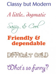 drawers full of metal letters, all designed to be set by hand, which was incredibly laborious. Newspapers literally used hot metal to create each page as an aluminium plate, one that would get melted down to form tomorrow’s plates again and again.
This exposure taught us a far greater understanding of types’ origins, and to respect type and typographers well into our digital careers.
So have computers made things better or worse? Well I think there have been some gains, speed and access to fonts is much better. Where we used to rely on a beautiful magazine named U&LC for all our font news, now we get it on the web. I do think standards have slipped. With everyone having access but not really understanding type and letter-forms, an ugly landscape of unprofessional and poorly executed typography prevails.
The furore over the subtitles used in the film Avatar is a case in point. Often the untrained eye will use a completely inappropriate font, causing untold damage to the original product. This can be true across the whole gamut of design services, from websites and packaging, to brochures and advertising. Anywhere the public must be communicated with is an opportunity for beautiful typography.
And it’s not just about legibility … who wants to look at an ugly face?!
Recent comments